Whilst our recent content has focused on COVID-19 and the associated fallout, I thought this lockdown side-project of mine might serve as a welcome interruption from the more serious content out there. Plus, it’s all about raising the profile of local government and appreciating its presence and impact in our daily lives.
Council logos – there’s a lot of them.
From the grand old world of classic heraldic design, medieval regalia and armorial bearings to bold stand-alone fonts, modern conceptual designs and brand identities.
What started as general curiosity at the sheer diversity of logos (I spend a lot of time browsing council websites), soon turned into fascination and a desire to catalogue all 360ish A to Z – the overwhelming urge to order the universe.
It took until the middle of the alphabet when this labour of love got a bit tedious, but I’ve gone full circle again, and I’m back at being genuinely delighted by the wonderful world of council logos. I’m not the first to tread the path of council logo compendium, with plenty of hype around the London Boroughs then and now, Welsh councils have also been mapped previously, and I have recently learnt of a stellar collection of council logos on bins. However, as far as I’m aware there is not a public record of them all, and I thought this needed rectifying.
Since embarking on this mini-project I’ve considered the local government units that have the challenge of functioning as ‘container geographies’, territorially bounded in ways which often don’t correspond with much lived experience. It certainly can’t be easy to unify disparate communities under one shared vision through the medium of a council logo. This must be the process for new unitary councils, spanning and uniting hitherto unique places.
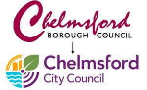
But it’s not just newly formed councils that have to consider their visual identity, council logos have always evolved over time. For example, when city status is granted it forces a rethink for many local authorities on how to build their new image. If they have to change all their letterheads and signage etc. then they might as well give the logo a bit of a refresh too. In the case of Chelmsford, I rather like the transition.
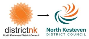
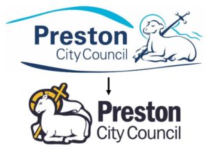
Council’s official ‘statutory’ logos must appear where there is a legal requirement, and nowadays there is the added consideration of electronic usage. What might have looked fabulous adorned on a plaque over the town hall, may not work so well as a tiny twitter profile pic. And sometimes, the various logo elements just need to be rejigged, condensed or simplified so they can be replicated through the council’s various public facing activities, like the examples of North Kesteven and Preston below.
Some villages, towns and cities have changed beyond recognition over the past few decades. In addition, for local authorities the key challenges that councils face have transformed the nature of their work and how they deliver services, and often a new brand can reflect these shifts.
There’s a part of me that feels a bit uneasy about ‘brand identity’ for councils, as if there is something too superficial about it for such a fundamental institution. Place-branding and destination-creation for tourism makes sense, yet I’ve sometimes questioned it in the realm of public service. Especially when considering the cost vs. value of a council rebrand, with some reported to have spent up to £86,000 (maybe more) on design and implementation.
But brands are purposeful and memorable and why shouldn’t the dedicated work of local government be communicated and recognised through a solid visual identity? Plus, it shouldn’t be a reflection of a council’s identity per se, but rather a representation of how local people perceive the place they live in, and a collective understanding of the council’s role in the community.
Having a dialect of place is so distinctive to an area, and the advantages of compiling all council logos (for England and Wales) in one place is that you start to see common themes emerge, and it becomes a lot easier to spot the curious exceptions. As John Stewart has aptly pointed out, understanding the nature of local government is based on an analysis of uniformity and diversity, continuity and change.
I’d say this applies to the world of council logos too.
So, what have I learnt of council logos so far? All will be revealed next time in part two.