In part one I kicked off with a brief introduction to the world of council logos, this part sets out what I’ve learnt.
Council logos – the insights.
My methodical process initially entailed scrutinising the contents of each logo, in order to identify the presence of various design components in hope of producing a typology. But I ended up ditching that procedure in favour of just delving into the ones that looked cool – and despite my scattergun approach eventually some themes emerged.
Coats of arms
Dating back to medieval times the coat of arms is the logo of a bygone era, with each separate element signifying an aspect of the local historical background or noble ancestry. Most are adorned with Latin inscriptions, armour, crowns and creatures, and many are quite militaristic. I won’t dwell on all of the detail – because there is a lot, but the shields and crests that once formed the bedrock of civic identity remain to this day in a quarter of all council logos.
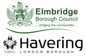
Under heraldic law in England a coat of arms is granted to a corporate body (even Tesco has one) instead of the place that it governs. The coat of arms must be distinct from all others on record, and according to the College of Arms “there is a long tradition of puns in heraldry, some of them obvious, others less so.” These visual puns, known as canting, can be seen on several council coat of arms, take Elmbridge for example, there’s an elm tree on a bridge. And Havering? It has a ring.
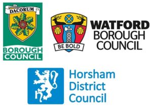
Whilst many coats of arms appear as they would have done centuries ago, some logos have taken on a hybrid form with Dacorum, Watford and Horsham recontextualising the historical element and providing a contemporary take on the coat of arms.
One aspect worth investigating further is if the coat of arms is more likely to be found in provincial councils or those with strong traditionalist leanings. I might also compile all of the Latin mottos and their various translations – if anyone is fluent, get in touch.
Colours
Green takes top spot for being the most popular main colour on council logos, and I wonder if this is an attempt to avoid any overt political association (Green party aside). The usual suspects follow with blue and then red coming in next. Unsurprisingly, brown is the least represented main colour.
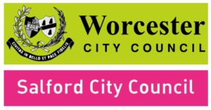
Worcester must be given a special mention for the only display of lime green, and Salford makes a statement with shocking pink.
Animals
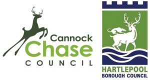
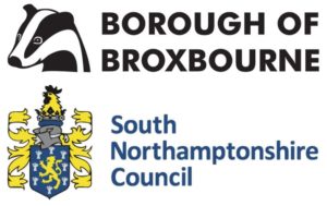
There are plenty of heraldic beasts to be found on council coats of arms – lions and eagles were to be expected really. But with the more modern depictions of council logos, the deer seems to be the most popular standalone animal, with the one from Cannock Chase looking particularly graceful, and I think I can spot a rat on the back of the deer in Hartlepool too. Lesser spotted animals include the very friendly looking badger on Broxbourne’s logo, and the crowing rooster atop of South Northamptonshire’s logo.
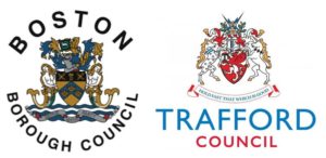
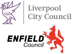
Mythical creatures are in abundance – Boston has mermaids, Trafford has unicorns, Liverpool has the Liver Bird and Enfield, well, has the Enfield.
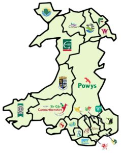
And a round of applause for whoever created this brilliant map for Welsh council logos, interesting to note that only those in the south feature dragons.
Nature
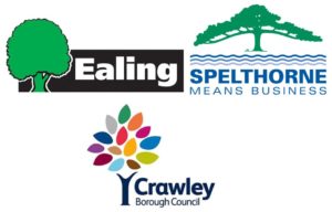
Nature is a big theme with water and trees found in 15% of all logos. As you’d guess, nature tends to feature more in rural council logos, with leaves, hills and crops adorning quite a few of these. But even urban councils like Ealing focus on the trusty tree. Spelthorne arguably presents the grandest tree – they also mean business, whilst Crawley’s is the most colourful.
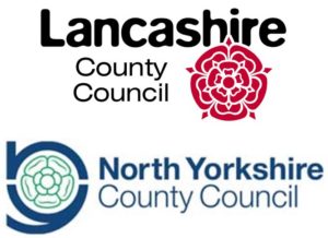
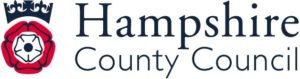
Roses are a recurring motif throughout, with the opposing Red Rose of Lancaster and White Rose of Yorkshire featuring on logos from their respective areas, but warring historical houses notwithstanding, its Hampshire that boasts the united Tudor Rose.
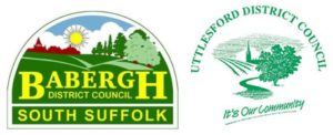
Some logos are really quite picturesque and scenic, a nod to Babergh is in order – and no wonder because I’ve recently discovered it was ranked the 2nd happiest place to live in England by the Royal Mail UK Happiness Index 2019. I’m also very fond of Uttlesford’s, as it conjured up nostalgia for a place I’ve never visited.
Shapes
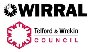
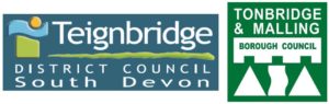
Some council logos have entered the realm of abstraction. These tend to be more recent and represent a shift from denoting concrete entities and objects – relating to place or history – towards connoting a set of brand values. Circles are present in many logos and are said to project community and trust, whilst triangles and squares can be interpreted as stability and strength. I think Wirral does a good job of visually encoding the idea of unity in diversity, and Telford & Wrekin makes good use of hidden letters too. Teignbridge is certainly very ‘shapey’, as is Tonbridge & Malling.
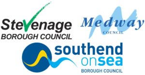
Lines feature prominently in a lot of logos. Efficiency and consistency could be the message they’re trying to convey, and the tick in Stevenage is certainly encouraging. The swoosh-like elements of some logos are likely intended to illustrate dynamism – wavy lines seem to be the dominant force flowing through most: Medway and Southend as cases in point.
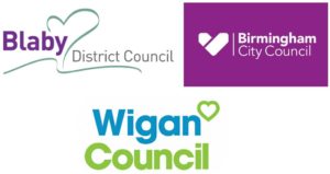
It was quite warming to find heart shapes in the Blaby, Birmingham and Wigan logos, and I think more significance should be given to the empathic and caring role of councils in the community.
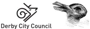
A few of the logo designs incorporate a very abstract approach and defy any conventional shape naming. In some examples the lines form an image that can be interpreted differently depending on which way you tilt your head. I can see both a ram and a snail in Derby’s logo, a bit like that famous rabbit-duck illusion.
Artistic style
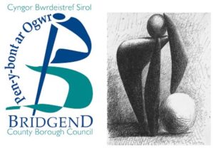
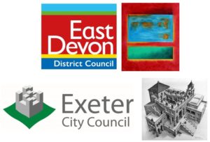
The more you look at council logos the more you see. After poring over them for hours I started thinking about artistic style, and this could be due to saturation because I might have gone astray here – but I can’t help wondering is Bridgend a bit Picasso? Is East Devon a bit Rothko? And is Exeter a bit Escher?
Place
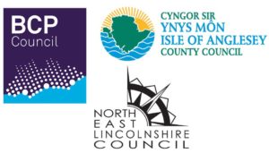
Conveying place identity is often best done through local geography. For the newly formed council of BCP (an amalgamation of Bournemouth, Christchurch and Poole) using the map and coastline has made it far easier for residents of previously distinct communities to rally around something recognisable to all. Isle of Anglesey also presents itself like this, but almost seems more tropical than Welsh. Whilst the North East Lincolnshire logo helps orientate you and has a compass pointing to the – yep you guessed it.
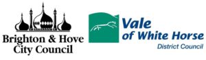
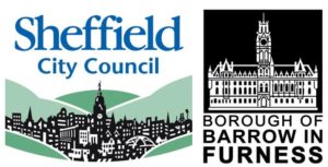
Landmark logos incorporating a well-known feature of the area are also popular, with Brighton & Hove depicting their pavilion and the Vale of White Horse presenting their prehistoric hill figure. Some of my personal favourites spotlight their marvellous municipal architecture with Sheffield and Barrow-in-Furness placing their town halls front and centre.
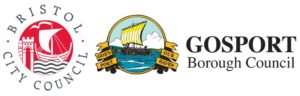
When it comes to coastal councils, seaside scenes are often shown – with Bristol displaying its maritime history and Gosport appears to have a Viking ship heading to shore.
Retro vs. modern
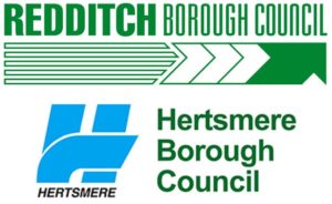
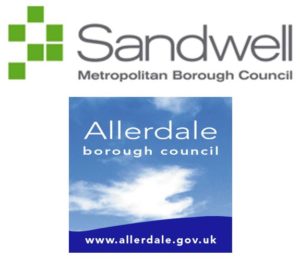
Thinking about logo designs that might be decade specific, there are certainly a lot of retro logos – Redditch and Hertsmere definitely come to mind. I also see elements of Tetris in Sandwell’s, and Allerdale’s does make me think of the Windows ‘98 desktop background.
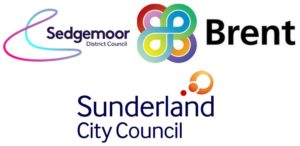
Examples of logos that come across as characteristically modern with their round and polished appearance denoting ‘concept’ are Sedgemoor, Brent, and Sunderland.
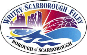
But in my eyes, Scarborough has to win the most futuristic and visually exciting council logo.
Font
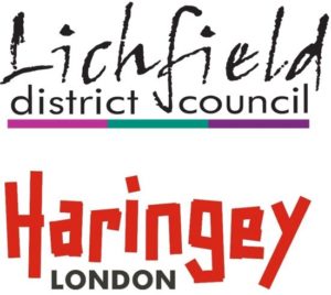
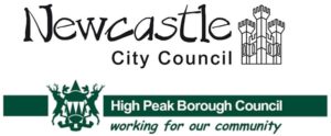
There are some logos with no pictorial elements: 1 in 10 logos are simply the letters spelling out the name of the council. A very wide variety of fonts show up, some of the most distinctive typefaces are found in Lichfield, Haringey and Newcastle – and even the cheerful Comic Sans makes an appearance in High Peak.
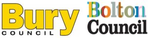
I think the logos preferring to state the council name only brings a degree of gravitas, the council’s reputation precedes it, no need for embellishment. So it must be mentioned that Bury does an excellent job of being very bold and notably yellow, and Bolton likewise, but with stripes of colour.
Miscellaneous
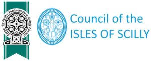
There are a few more council logos to point out that have fairly unique detailing, and are of course very place specific. I especially like the Celtic cross in Pembrokeshire and the lighthouse in the Isles of Scilly.
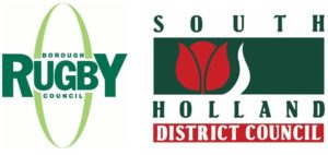
Rugby has chosen to represent itself by the gentleman’s game and the tulip in South Holland does look very Dutch.
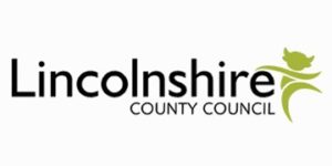
Lastly, Lincolnshire’s logo looks like a devil at first glance, but I’m told it’s an imp.
So, there you have it, some highlights from the world of council logos. And for those councils not specifically mentioned above, my brief study of council logos has taught me that all are worthy stamps of civic pride.
Unfortunately, there is not enough time in the day for me to know the origin or story of each of them. But from the logos that I have researched further, it is amazing what you can learn about a place you have never heard of purely through the images it chooses to represent itself.
Next time in part three I’ll reflect on how these symbols of civic pride and place identity relate to the role of local government.